K12 Student Information System App
What is a Student Information System (SIS)? It is a management information system for education used to manage student data. It integrates students, parents, teachers and the administration. Student information systems provide capabilities for registering students in courses; documenting grading, transcripts of academic achievement and co-curricular activities, and the results of student assessment scores; forming student schedules; tracking student attendance; generating reports and managing other student-related data needs in an educational institution.
ProgressBook (now apart of frontline education) had a legacy hybrid SIS app that had 21,868 users and 127,524 pageviews in 2022 but only a 1.3-star rating in apple’s App Store. The solution needed to be redesigned with deep understanding of the school administrators. Through research, information evaluation, and ideation the new design is easier to navigate and meets their needs elegantly.
Legacy ProgressBook
Hybrid App
Before / After
New Frontline SIS
Native App
Home Landing Page
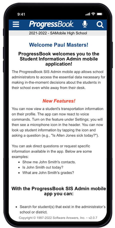
The legacy landing page design had a marketing approach and how-to messaging for the app. Marketing info is not needed if someone has all ready downloaded and installed your app. How-to messaging is redundant if the UI has an intuitive design experience.
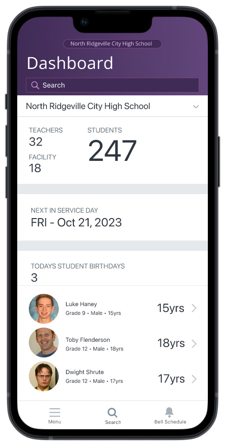
The new design services up key information about the selected school. It includes daily birthday information for students to give better personal insight for students.
The top header includes a district switcher pill and student search. The bottom footer in the all important ‘thumb-zone’ includes three options.
- Menu – for navigation
- Search – the top action for finding student information
- Bell Schedule – the schedule the school follows
Student Profile
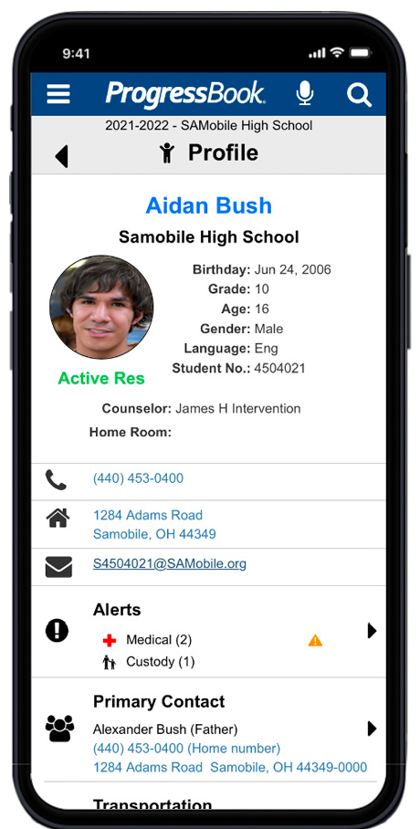
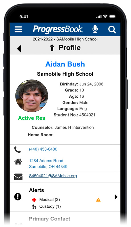
The legacy Student Profile only used a top blue header for navigation and took up most of it’s precious screen real estate with a logo, ProgressBook that did not provide any functionality to a school administrator.
The student profile picture aspect ratio was not maintained and appeared squished.
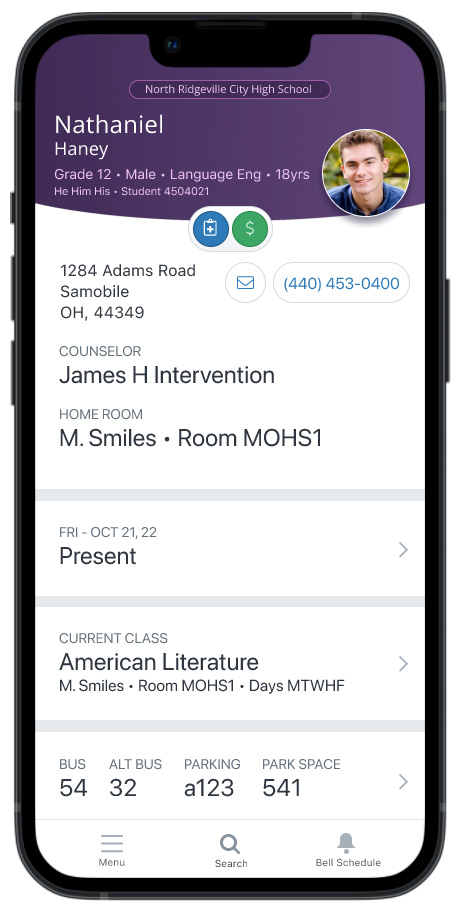
The new design places the students name as the page title to communicate who’s profile you are viewing and moves navigation to the lower ‘thumb-zone’.
Student Alerts
The new design puts a bigger priority on Student Alerts by moving them up vertically to the top of the page. These alerts are critical and can be a life threatening Medical Alert.
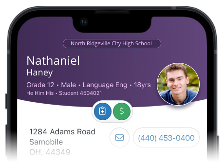
By removing the redundant iconography the new Alert iconography stands out better and doesn’t compete with the clutter in the visual hierarchy.
The new iconography is consistent with the desktop solution for continuity.
Nesting
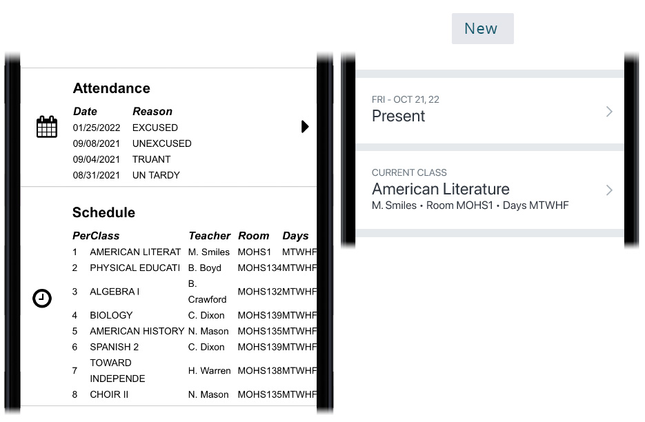
The new design uses better data nesting on the Student Profile by serving up actionable metrics and keeping full screen data grid details only a click away.
In this example by removing the full Schedule & Attendance multi-day history we afford mobile on-the-go statuses for finding a student in a hurry in case of emergency.
- Current day attendance – Present vs full Attendance history
- Current class American Literature vs full class Schedule
